Sunday, November 29, 2015

Data Collection with ArcCollector

Introduction:

The purpose of this lab was to give the student experience using ArcGis online as well as creating domains related to a particular feature class. The feature class created was used to collect data using the ArcCollector app. Information about different types of trees as well as squirrel nests were collected during this survey.

Study Area:

This week, the study area was at a location other than campus. I was traveling for our Thanksgiving break, so I collected data near Plainview, MN. A family member has an old farm house, with a large lot that has many different tree species present on the property. Since I was not able to be on campus, this was the next closest place that had similar attributes.

Methods:

In order to successfully collect data for this lab, domains needed to be created within the Geodatabase used to hold all of the data. There are two different types of domains that could be used: range or coded. Range domains are used when working with numeric data. In order to set a range, a maximum and minimum value must be entered. Coded domains are able to be used with any type of attribute information. Coded values set what information can be entered for a specific attribute. This makes adding information much smoother while in the field. The domains that were set for this exercise were the size of the tree, type of tree, tree species, if leaves were present and if there were any squirrel nests in the tree.

Once all of the domains were set it was then time to create a new feature class. A point feature class was created for collecting data on different types of trees. The feature class would be used in the Collector app. In order to allow for the data to be shown correctly, the coordinate system of WGS 1984 Web Mercator (auxillary sphere) was set for the feature class' projection.

Once the feature class was created, it then needed to be published on ArcGIS online. If it was not published, it would not be able to be used on the Collector app. It was during this publishing step that I encountered a few problems. I was able to create the feature class and get it onto ArcGIS online, but it would not transfer onto my Collector app. After numerous troubleshooting ideas, I found out that I had not made my feature class and editable layer. Since I could not edit, I was not able to use the file and that is why it was not showing on the app. Once that problem was solved, everything worked how it was intended and I was able to see my map on the Collector app.

The next step was to collect data in the field. I had to walk to each individual tree and make a point and enter the specified attribute information. Since there were numerous trees, I did not have to travel very far to get the 20 points needed for collection. Total collection time took about 30 minutes. Once all of the data was collected, it then needed to be downloaded from ArcGIS online to be used in ArcGIS for desktop.

Discussion:

The data shows that the most distinct difference for the different attributes collected is related to the type of tree present. I broke this down into two different categories: deciduous and coniferous trees. The figure below (Figure 1) shows the results of where the different tree types were located.


As the figure above shows, there is no real pattern as to how the different tree types are dispersed about the property. The one thing that can be noted, from this sampling, there is a much higher percentage of deciduous trees on the property compared to coniferous trees present. Breaking this down even farther, we will be able to see the different types of trees species are present on the property. The figure below (Figure 2) shows the different type of tree species that are present on the property. 

This map shows where the different types of tree species are located across the property. Although it is dominated by deciduous trees, there are many different species present. 

After completing this lab I realized that I should have done a few things differently. One major flaw I found with my survey method is that I did not have enough domains set for the different types of trees I was going to encounter. There were many trees I was not able to survey simply because I did not have the domains set. 


Conclusions:

This exercise helped me to realize the importance of prepping your data before going out to the field. Setting different domains up correctly before going to the field saves lots of time when collecting data. It also makes you think about the data you will be collecting and what will be the most efficient method for field collection. Although the collection of the trees is the goal of this lab, I learned many lessons from it. Learning how to collect data in the field from many platforms, such as a smartphone, is a very valuable skill to learn and continue to develop. 


Conducting a Topographic Survey with a Dual-Frequency GPS

Introduction:

The last couple of weeks we have been working on two different projects, but they are closely related to each other. The first part was conducting a topographic survey with a dual-frequency GPS. The second part was was conducting a topographic survey using a total station. These two different methods can be used for surveying different types of terrain. The end goal of this lab was to be able to compare the results of both techniques in order to see if one was more or less accurate than the other.

Study Area:

The study area for both parts of this project was the campus mall at the University of Wisconsin-Eau Claire. The campus mall is located on lower campus. It is surrounded by many of the academic buildings and is bordered by the little niagara creek that runs through campus. The mall is relatively flat with a slight increase in elevation as you move north away from the creek towards Schofield Hall.

Methods:

Survey with a Dual-Frequency GPS

The first survey method that was conducted used the Topcon Hiper (Figure 1), Topcon TESLA (Figure 2) and a MiFi wireless router. In order to accurately collect our data points, the Hiper needed to be screwed to the top of the surveying rod and the TESLA unit was also attached to the surveying rod, about 1 meter off of the ground. The MiFi wireless router was connected to the Velcro strip on the surveying rod. The Mifi unit needed to be in close proximity to the the other equipment in order to allow for them to stay connected to one another.

Figure 1. This is the Topcon TESLA unit that was
used during both parts of this lab. 


Figure 2. This is the Topcon Hiper unit. 


After all the equipment was set up and connected to one another, a folder needed to be created on the TESLA to store all of the data we were going to collect. The folder contained the file name as well as other data, such as what projection was used to collect the data. The goal of this lab was to collect elevation data of our study area. The TESLA has two different data collection methods, solution and quick. Solution mode took a specified amount of points and then averaged them all to one point. the TESLA then showed the user the accuracy of that point. If the accuracy was acceptable, it would then be saved by the user.  Quick mode also took a specified amount of points and then averaged them, like solution mode. The main difference is that the averaged point was automatically saved. The accuracy would be shown to the user, but they did not have to option to save it or discard it.

Once all of the equipment was set up, turned on, connected to one another and a data folder was created, we were able to survey the study area. The assignment called for 100 points to be collected. While collecting the data, it was very important to keep the survey rod level. The survey rod needed to be leveled out each time before a point was collected. If the leveling of the survey rod did not take place, it could throw of the results of the survey. The class ran into a problem where the TESLA unit would only save 25 points for each folder created. In order to work around this problem, each group had to create 4 folders for their project in order to gather a total of 100 points.

Surveying with the Total Station:

The second part of this lab involved surveying using the Topcon Total Station (Figure 3). The total station was used to collect elevation, GPS location data as well as distance. Before the total station could be put in place, two important points needed to be collected. The first point was the occupy point. This point is where the total station will be placed and will stay throughout the duration of data collection. The second point is the backsight point. This point is what the total station will use as a zero point in order to calculate the azimuth values. Once these two points have been collected, the total station can then be set up for data collection.

Figure 3. This is the Topcon Total Station. This piece of equipment was used to complete the
second part of the lab. 
Setting up the tripod for the total station is very important. The first step is to set the tripod up at a height that will be comfortable to use for group members. After the tripod is set up, the total station is then attached to the top, making sure it is centered over the occupied point. Once it is centered over the occupied point, it is critical to ensure that the tripod is level. There is a bubble level on the tripod, and it must be centered to ensure data accuracy.

After the unit is level, the data collection can then begin. The total station is connected via Bluetooth to the TESLA. A new folder then needed to be created for the project and the occupied point as well as the backpoint were then entered into the setup. This was done to ensure the accuracy of the data being collected. The heights of the total station as well as the reflector needed to stay consistent in order to maintain data accuracy. Our group was made up of 3 members which made data collection fairly easy. One person moved throughout the study area with the reflector, another member looked through the total station to make sure they were lined up while the last member operated the TESLA.

Once all of the points were collected, the data then needed to be exported to a flash drive. A flash drive was connected to the TESLA unit in order to extract the data. The data needed to be exported as a .txt file in order to be used later in class. Once the file was brought into ArcMap it could then be edited to show what was collected.

Discussion:

The elevation data that was collected on the campus mall was fairly accurate. The more accurate model of the two was creating an elevation model using the Topcon Hiper. Figure 4, shown below, shows the results of that survey.

Figure 4. This map shows the results of the dual frequency GPS survey method. 


The extra accuracy of this model can be attributed to more points being collected. There were 75 more points collected using this method as compared to using the total station. Although the points were randomly collected within the study area, there is a fairly even distribution of points throughout the study area which also helped to create a more accurate model. Figure 5, shown below, is the result of using the Topcon Total Station.

Figure 5. This map shows the results of surveying the study are with a Topcon Total Station.
This model is fairly accurate, but does not model the terrain nearly as accurate as figure 4. As shown above in figure 5, there were much fewer point collected with the total station. Although they seem to be fairly even in how they are spread throughout the study area, it still does not give the most accurate representation of the study area.

Results:

This lab added to my knowledge of conducting geospatial surveys. After going through both methods I am now able to know which method could be better used in certain situations. The dual frequency GPS survey may take a little more time while collecting the data, but it is highly accurate, with much less opportunity for problems to arise. The total station provides extremely accurate data, but takes much longer to set up. There is also a great possibility that something may not work as it is supposed to which can take more time away from data collection.

Saturday, October 31, 2015

Navigation with Map and Compass

Introduction:

The lab this week was a continuation of the lab we completed last week. The navigation maps that were created helped the groups navigate the different courses located at the Priory. The students had to use the navigation maps with the help of a compass to navigate the different courses.

 Study Area:

The lab this week took place at the Priory. This land is owned by the University of Wisconsin - Eau Claire and is about 3 miles south of campus. The landscape varies throughout the property. It is mainly wooded, with a few open areas. The terrain is rolling and has steep slopes in multiple locations. These land features played a big role in affecting the success of each team navigating their specific course.

Methods:

In order to navigate a course using our navigation map for the activity, we needed to have points to find. Professor Hupy provided each group with their own specific course of 5 different points. The points were in a UTM projection. Each group member plotted all 5 points, and then compared all their maps together. This was done to make sure all the data points were plotted accurately. Once all group members agreed on the position of the points, it was time to navigate the course. In order to get the correct bearing for what direction we needed to travel, our group decided to draw straight lines connecting all of the points. The figure below (Figure 1) shows how this procedure was done.

Figure 1. This is how we connected our navigation points. 

Once all the points were connected, we measured the length of them to get a distance we would be traveling. This distance would then be compared to the pace count that was collected two weeks ago during class time. The figure below (Figure 2) shows the distances between all of our points. 

Figure 2. These are the different distances between each point. These distances were
compared to the expected and actual pace count.

After plotting all the points, connecting them and measuring there length, it was time to start navigating the course. We were told that the points were marked by bright colored tape and had a different number written on them. This number corresponded to the navigation course and each specific point. 

When navigating the course, each group member had a specific role. One person was the pace setter, one person was the person pointing the direction to be traveled and the last person made sure the pace setter was traveling in a straight line. This procedure was put in place to in order to navigate the course as accurately as possible. 

Our group was able to find every point on our course except for point number two. There were two reasons we were not able to correctly identify point number 2. The first reason was that our starting point, or point number 1, was not correct. This happened because there was a trail with brightly colored tape on a trail and we misidentified our starting point, and started at the wrong piece of bright colored tape. The second reason we were not able to find this point was that the flagging had been taken off of the tree. The figure below (Figure 3) shows where the flagging should have been located. 

Figure 3. Morgan and I standing by point number 2. This is where the flagging should have been
but was not present. 

 The missing flagging is likely due to other people removing it from the tree or the natural wear and tear of leaving the flagging out caused it to fall off of the tree. Once we were at point number 2, we then had a definite starting point which helped us to more accurately navigate the remainder of the course. Although we were able to find all of the other points, we did not make it directly to the tree where the flagging was attached. This is likely due to human error of keeping a constant direction while navigating the terrain. Some of the terrain on our course was extremely difficult to navigate, which made it difficult to stay on course.

Discussion:

This lab helped to provide insight as to what would be and wouldn't be useful in a navigation map. The first thing that I found was that the basemap that I chose was not the most ideal for our purposes. All of the detail made the map look very cluttered and was difficult at times to use. If I were to do this activity again, I would use a terrain basemap. This would simplify the map much more and show the different terrain features as well. The next thing I would change is the elevation contour lines. I added them to the map, but I did not label them. Without having a label, it is nearly impossible to see what you are navigating. You will be able to identify different features with unlabeled lines, but you will not be able to tell if they are rising or falling elevations. The last thing I would change about my map is to make the grid lines slightly smaller. The reasoning behind this is to have grids that aren't quite as generalized. The 50 by 50 meter grids that I created worked, but were not as efficient as I would have liked.

The terrain at the Priory created unique challenges of its own for our group. Not only was it steep in some areas and difficult to navigate, it also affected the expected pace count. Most points were about double what the actual pace count should have been. This is due to the varying terrain as well as the different types of vegetation that had to be traversed.

Conclusion:

This lab was very insightful and helped teach a lot of valuable lessons. This activity took group cooperation for it to be completed successfully. It also taught the students what is important in map creation. More importantly, it taught them to identify the outcomes of a project, and use that to help them in their map design.

Monday, October 26, 2015

Development of a Field Navigation Map and Learning Distance/Bearing Navigation

Introduction:

This weeks lab was a prerequisite for next weeks project. This week the class learned about map construction and the different elements in creating a map used for navigation. Two maps were created using different coordinate systems. One map was created using a UTM coordinate system, while the other was WGS84 and shown in decimal degrees.

Study Area:

There was no data collected in the field for this lab, but the area being analyzed is the Priory. The Priory is a piece of land the University of Wisconsin - Eau Claire bought recently. It is located roughly 3 miles south of town.

Methods:

Since these maps were going to be used for a navigation activity, it was important to get a pace count for the navigation. This pace count represented a 100 meter distance walking under ideal conditions. After a pace count was figured out, the students went to the lab to create the different maps. All of the data for this lab was provided by Professor Hupy. Some of the data sets included contour lines, points from last years class as well as various aerial photographs of the Priory.

It was up to the student to create a map that would suite the needs of the lab. The figures below (Figure 1 and 2) are the final maps that were created.

Figure 1. This map shows the study area with a UTM projection. 

Figure 2. This map shows the study area with a UTm projection. 

In order to create a map that could be used for navigation, a grid needed to be created for both maps. I decided to go with a 50 by 50 meter grid. This seemed to be the appropriate distance for the purpose of the lab. A greater distance would cause the map to become to generalized while a smaller distance may cause it to look much more cluttered.  Since the maps were created in different coordinate systems, the grid lines were showing different numbers. The way these numbers were displayed had to be changed within the grid properties. Without changing anything, they would not be able to be easily identified. I also added a 5 meter contour line. This line allowed for the elevation of the study area to understood. 

Discussion:

After going through this lab it was apparent that map creation is a pivotal step if it will eventually be used in navigation efforts. Although both maps needed a grid, the grid numbers needed to be shown in different ways. One particular method may not work for multiple maps. An important feature of this map is also the contour lines. The class was provided with a 5 meter and 2 foot contour lines. After close examination, I decided to go with the 5 meter contour lines for my map. The reasoning for that is the 2 foot contour lines do more harm than good. They may provide more elevation data, but it is much harder to understand on the map and creates a cluttered look. The 5 meter contour lines proved fairly easy spacing and allow for a much easier understanding of how the terrain lays in the study area. Since the maps were going to be used for navigation, I figured that aerial imagery would be the best base layer for the goal of the lab. It showed building and vegetation, and may help if we become lost. 

Conclusion:

This lab is very important in teaching the details of map design. The map design may change depending on the goal of the map. It is important to know what features will enhance your map and what features may hinder its purpose. 

Saturday, October 17, 2015

Unmanned Aerial Systems

Introduction:

This week the class was taught about the growing field of unmanned aerial systems. This developing technology, coupled with geospatial tools can be extremely useful in many situations. Since there are so many different technologies associated with UAVs, the class was exposed to the basics and given a very general overview of how they are used. Although it was an overview, many of the skills learned during the lab are extremely useful when beginning to work with UAV technology.

Study Area:

The study area is on the flood plain of the Chippewa River at the University of Wisconsin Eau Claire's Campus. The floodplain is on the north side of the river under the student walking bridge.

Methods:

The first step in flying a successful UAV mission is to choose the correct type. The two different types discussed as a class were fixed wing and multirotor. These two types have their advantages and disadvantages

The first type discussed was the fixed wing UAV, which is shown below (Figure 1).
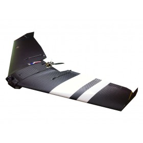
Figure 1. This is a fixed wing UAV. 

One of the biggest advantages of this aircraft is the very simple structure. This simple structure allows it to glide much easier and travel at faster speeds. Typically this aircraft can carry more weight, which could be power sources, thus allowing for longer flights. Although there are many benefits of this type of aircraft, there is also a large disadvantage. This aircraft typically needs a larger area for takeoff and landing. This can cause problems for quick set up missions, unless it is located in a fairly open area. 

The second aircraft discussed was multirotor (Figure 2). The aircraft's biggest advantage is just the opposite of a fixed wings disadvantage. 
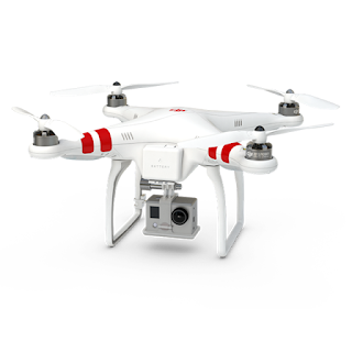
Figure 2. This is a multirotor UAV. This specific model is the DJI Phantom, which was used
for a field demonstration for the class. 
This aircraft allows for much easier takeoffs and landings due to its ability to initiate flight vertically. This is a great advantage because it allows the user to takeoff and land in limited space. Although this model can be extremely useful, it is also much more mechanically complex compared to a fixed wing aircraft. This makes for fixes to be much more difficult. This aircraft also does not fly as long or as far as a fixed wing aircraft. 

Demonstration Flight:

In order to get an understanding of how UAVs work, Dr. Hupy took the class our for a short mission. (Figure 3). 

Figure 3. Dr. Hupy explaining the specifics of the UAV used during
a class presentation. 
The UAV used was a DJI Phantom and was flown manually (Figure 2). This is a multirotor that worked well for our purpose and study area. On the floodplain there was a large number 24 surrounded by a circle. This figure was made out of larger rocks found on the floodplain, thus having a slightly higher elevation than the surrounding area. With the UAV overhead, multiple pictures were taken of this figure, enough where there would be a large amount of overlap. This overlap was necessary for the processing of the images to take place later on in the lab. 

Real Flight Simulator:

Since not every student in class will have a chance to fly an actual UAV, the students used Real Flight Simulator software to give them some flying experience. The software has over 140 different aircraft models for the students to choose from. As was to be expected, the fixed wing aircraft needed much more space to take flight but could travel at much higher speeds. During flight the controls were much more sensitive compared to a multirotor aircraft. Along with sensitive controls, the stability of this aircraft was much lower than that of the multirotor. The multirotor aircraft was much easier to handle and adjust during flight, but could not fly nearly as fast as the fixed wing. Also, as one would expect, the amount of space needed to take off and land was significantly lower than that of a fixed wing aircraft. 

Software Utilized:

The first piece of software that can be utilized for a UAV flight is Mission Planner. This software can be used to plan out automated missions. Since the UAV was flown manually for the class, this software was not utilized for our data collection, but it was explained to the class. This software is extremely powerful in helping to plan out a successful mission with the equipment that is on the UAV. Some variables that have a significant impact on a mission are the type of camera sensor being used as well as the altitude of the UAV. 

The focal length of the lens on the camera being used is very important to consider before a mission. The focal length of a lens tells you the angle of the lens, or in a simpler sense, how much of area will be captures. Longer focal lengths will have a much narrower image being captured. Although the image is narrower, it gives you a higher resolution image. Shorter focal length lenses are just the opposite, they allow for a much wider image to be captured. There may be more area being captured, but it will not have a good of a resolution. 

A second variable to consider is the altitude at which the UAV will be flying. No matter what the focal length of a lens is, the higher a UAV is flying, the more area that will be captured during flight. Although you may be able to catch more area at a higher altitude during flight, it will have an impact on the resolution of the image. The altitude needed for flight would be determined by the goals of the mission.

The camera sensor, or focal length, coupled with the different altitudes that can be flown make up what is know as the field of view or FOV. The field of view is the extent that can be observed at any given time. This concept is extremely important when flying a UAV. Mission Planner takes all of these variables into consideration and helps to generate a flight plan for a given situation (Figure 4). 

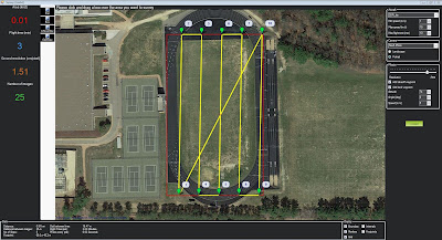
Figure 4. This is a screenshot of Mission Planner software. This is used as a tool to create automated
missions for a UAV flight. 

The image above shows the usefulness of the Mission Planner. You can create an area that will be flown and it will automatically generate flight lines and statistics about that mission. The camera and altitude can be changed, which will automatically update the flight lines for the mission. Along with the flight lines, it also gives you the resolution of the images recorded as well as how long the flight will take. The flight time is a crucial piece of information. Since the amount of time the UAV can be in the air is limited, it is important to use that time efficiently. 

The second software that was utilized was Pix4D. Not only was this software extremely user friendly, it is extremely valuable at mosaicing large numbers of images together. Knowing that a single flight can generate large numbers of images, this software is extremely helpful. During our class flight, many pictures were taken of a few different features. The feature I worked with was the number 24 surrounded by a circle. The images taken in the field were then imported into Pix4D and mosaiced together (Figure 5).

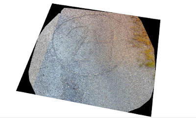
Figure 5. This is the result of Pix4D mosaicing all of the collected images together. 
As shown in the image above, you can clearly see the number 24 surrounded by a circle. If enough images are taken with substantial amount of overlap, a high resolution image can be created through image mosaicing. Although this is a great image, it has greater value when used with geospatial software. This image was then brought into ArcScene in order to produce a digital surface model or DSM. The image below shows the results of bringing the image into ArcScene (Figure 6).

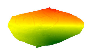
Figure 6. This image shows how the mosaiced image looks in a 3D view. This image was created
using ArcScene. 
As shown in the image, the number 24 and circle are raised compared to the surrounding land forms. This is a very simple way of showing the accuracy of the camera on the UAV coupled with geospatial technology. Although this is a very basic example, the same principles could be applied to much more complex situations such as measuring the amount of material being taken out of a particular mine. 

Discussion:

In a real life scenario, there is an oil pipeline that is running through the Niger River delta and it has been showing signs of leaking. Not only is the pipeline losing oil, it is affecting agriculture in close proximity to the pipeline. The company would like the assistance of a UAV in locating these areas with a possible pipeline leak.

Although the specifics related to the length of the pipeline were not provided, I will assume for the purpose of the scenario that it is a fairly long pipeline. After assessing all the needs of the client, I would recommend a fixed wing aircraft that has a high quality camera equipped with a near infrared sensor.The UAV that I would recommend is the QuestUAV Q-200 AGRI Pro Package (Figure 7). 

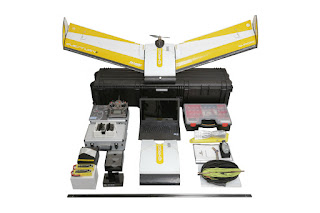
Figure 7. This image shows all of the things included with the QuestUAV Q-200 AGRI Pro Package.

The basic package for this UAV is priced around $28,000. It has a flight time of roughly 50 minutes and can cover up to 2,400 acres in that time (questuav.com). This package comes with two NDVI sensors as well as Pix4D that can be used for post processing of images collected. The near infrared sensors can detect the chlorophyll levels in the agricultural fields surrounding the pipeline. The lower the chlorophyll levels, the lower the quality of plant health. If these lower levels of chlorophyll are located near the pipeline, there may be a greater chance this is where a leak is occurring. 

Not only does this package come with sensors that will help find damaged agriculture, it also comes with mission planning software. This software will allow for flights to be planned around suspected areas of a leaking pipe. This UAV can help to find the currently leaking pipes, but will also help to locate a new leak before it becomes a larger problem. 

Conclusion:

Overall this exercise was extremely useful. It provided great insight into the growing field of UAV technology. The uses for a UAV are continually growing. Although we were not able to use all the the different technologies associated with UAVs, we were exposed to many of them and have a better understanding of how useful it can be when coupled geospatial technologies. 


Sources:

http://www.questuav.com/store/uav-packages/q-200-agri-pro-package/

Friday, October 2, 2015

Distance/Azimuth Survey Methods

Introduction:

Last week in class, we learned how to survey an area using a grid survey technique. This week, we learned how to conduct a survey using the distance/azimuth method. In this day in age, we have many different high tech instruments that can be used for precise surveying methods. Although this technology is great, it can, and usually at the worst time, does fail. This could be caused by many factors including bad weather, or something as simple as instrument malfunction. It is important to know different methods of completing a particular task, and this is what that lab this week was intended to teach the class.

The instrument our group used this week is called a TruPulse Laser (Figure 1). This instrument gave us the reading for both the azimuth as well as the distance we were from the object being surveyed.
Figure 1. This is the TruPulse Laser that was used to collect data.

Although this instrument can be extremely useful, it can also have its downfalls. During the demo for this exercise, the class found out first hand problems that can arise while using technology. At the location where points were being collected, we discovered what electromagnetic interference (EMI) can do to your results. It caused many of our points to be inverted, or no where near where they were actually taken. After going through this experience in the demo, we learned it was important to keep EMI in mind when collecting data so it does not ruin a survey.

Study Area:

The exercise this week called for the students to survey an area that ranged from a quarter to one hectare in size, as well as collecting a minimum of 100 data points. Given the parameters of the assignment, our group decided that our study area should be the parking lot south of Phillips Science Hall. We decided that the best option would be to collect data on the vehicles that were in the parking lot. Since it is a large open area, it also offered excellent visibility to enable easier access for data collection. The figure below (Figure 2) shows the area of study for our group.

Figure 2. This is a map showing the study area for the exercise. 

Although this parking lot offered many areas for collecting data, we were not able to collect all the data from one point. The figures below (Figures 3 & 4) show the view we had while collecting some of our data.

Figure 3. This image shows the parking lot from the third survey location. This image was taken facing east. 


Figure 4. This image was taken from the third survey location. This image was taken facing west. 

Methods:

Survey Methods:

In order to get the most accurate reading from the TruPulse Rangefinder, it should be mounted on a tripod. This allows for a constant height to be maintained throughout the duration of data collection. Although this may be the best method, you may not always have a tripod, which was the case for our group. Since it is important to keep a constant height while collecting points, we tried to keep the rangefinder in the same position while collecting our data, to minimize human error. Furthering this effort, one person read off the azimuth and distance, while another group member recorded the results in a spreadsheet. Not only did this allow for smooth data collection, it also helped increase our accuracy by minimizing the amount of times the rangefinder changed hands. 

Data Entry and Preparation:

As mentioned earlier, adding our data to a spreadsheet in the field saved us time when coming back to the lab with our results. Since we did not have to transfer from a written copy to a digital form, we were able to start performing analysis much sooner. After loading the spreadsheet on the computer, there were a few errors within our data. Some of the errors that we encountered were misspelled words or the same words with different letters capitalized. In order to perform effective analysis, these errors had to be converted into a standard format. 

Once the spreadsheet was all corrected, a geodatabase had to be created in order to store all of our features that would be created later in the exercise. After the geodatabase was created, the excel spreadsheet then needed to be imported into that particular geodatabase. The image below (Figure 5) shows how our data was structured.

Figure 5. This table shows how the data was organized while collecting points in the field. 


Although the method described above is the most ideal, things do not always work as planned. I encountered an error later in the lab that related to my excel spreadsheet. After numerous attempts to fix the problem, and advice from Dr. Joe Hupy, I realized I needed to convert my excel spreadsheet into a text file. The text file provided the same data that was in the spreadsheet, just in a different format. Once that problem was solved, I was able to continue on with the exercise as planned. 

After the text file was imported into the geodatabase, the bearing distance to line tool needed to be ran. The figure below (Figure 6) show what is used within this tool. 

Figure 6. This shows the different inputs needed to run the bearing distance to line tool.

This tool created lines that connected our survey points to the data points we collected. The input table corresponds with the text file that was imported into the geodatabase. The X Field, Y Field Distance Field and Bearing Field all correspond to the data that we collected while in the field. Once the lines were created, the features needed to be converted into vertices. The features to vertices tool enabled the student to complete this task. The tool inputs are show below (Figure 7). 

Figure 7. This shows the different inputs needed to run the features to vertices tool. 

Once the features were converted to vertices, they were added to map, as well as the lines created from the bearing distance to line tool. The vertices represent the actual location of the features surveyed. The figure below (Figure 8) shows both results. 

Figure 8. This maps shows the results of the bearing distance to line tool as well as
the features to vertices tool. 
Although it is important to know where the features were located, this lab also was meant to teach the student how to collect attribute data. The data attribute data our group collected was the color of the vehicles being surveyed. In order to show the different colors on a map, the vertices needed to be classified by the color attribute. The student needed to go into the properties of the feature class, and change the symbology of the points. Originally the vertices were shown with one color, but the symbology needed to be changed to show the points by car color. The map below shows the different car colors (Figure 8). 

Figure 9. This map shows the attributes for vehicle colors of the points we collected. 


Results and Discussion:

After looking at our data points and comparing them to the aerial imagery, they seem to be fairly accurate. Most of the points are on the edge of  the parking spaces, instead of the middle parking spot, but that is because of our surveying method. Since we were eye level with the vehicles, the point closest to us is what was measured, which would have been the edge of the parking spot. There was one data point that was extremely inaccurate. It showed up on the roof of Phillips Hall. Since it is not the parking lot, nor did it have a vehicle on the roof, this was most likely cause by human error. It could have either been a data entry error or the settings on the TruPulse Laser could have been different for that specific reading. There are also points that are very close to one another. This could have been caused by data entry error, but more than likely it is related to our survey method. Since we could not get all of our data points from one survey location, we had to change locations, but always looked at the same parking lot. After moving locations, the same vehicle could have been measured again accidentally. 

Conclusion:

This exercise taught the class different ways to collect data, specifically a technique that was not dependent upon technology. Although we were fortunate enough to use a TruPulse Laser, this same technique could have been used with a compass and measuring tape. It also taught the class different factors that could cause data collection error, such as EMI. All of these skills will prove valuable during data collection in many different situations. 

Sunday, September 27, 2015

Terrain Interpolation

Introduction:

The first weeks lab was designed to teach the student how to create a grid and collect data from their selected area. The data was then put into a Microsoft Excel spreadsheet to be used in this weeks task. This weeks lab was an extension of the first relating to terrain analysis. Before any of the data was converted into a terrain model, the class met to discuss different grid sampling techniques. This allowed for groups to express what worked well, what they would have done differently and suggest tips for other students in the class.

Study Area:

This week our group decided to change our study area. Originally we created our terrain on the floodplain of the Chippewa River. This week we decided to create our terrain in the volleyball courts behind a residence hall on campus. This allowed for the group to easily create a terrain with the sandy soil without having to deal with the vegetation that was present on the floodplain. The sand was damp and allowed for the structures created to hold their shape throughout the duration of the sampling.

Methods:

The survey method that our group first came up with was a straight grid system. We broke up our sandbox into 210 different sections, each grid square measured 8 cm by 8 cm. Originally, this seemed like a good decision to get a representation of the surfaces that were created. Measurements were taken in the bottom right corner of each grid square to keep the measuring technique as consistent as possible. The figure below (Figure 1) depicts how we took our measurements.

Figure 1. Shows how we collected our measurements
during the first round of data collection.


String was laid across the sandbox at 8 cm intervals and then taped to either side. This allowed for easy and consistent measurements to be taken. Although it provided an easy way to measure out grid, it created a very generalized representation of our terrain and did not catch steep inclines or declines of our features.


Once we collected all of our data it then had to be added into an Excel spreadsheet and normalized. The spreadsheet had a column for the X, Y and Z values that were collected in the field. Since the data was normalized in this way, it allowed each group to upload their data into ArcMap and view their points. In order to create a raster image of the points collected, ESRI Spatial Analyst extension had to utilized within ArcMap. Within the Spatial Analyst extension, the students utilized the interpolation tools to get an image of their terrain. For the purpose of introducing the tool, an IDW raster was created and showed the terrain. ArcMap shows raster images in 2D, so it is hard to see if it accurately reflects the points each group collected. In order to get around this, the IDW raster image was then opened within ArcScene which allows for images to be viewed in 3D. The figure below (Figure 2) is the results of opening the IDW raster image in ArcScene.

Figure 2. This image is the IDW raster image of the first terrain created by our group.
It is an inverted image of the actual terrain 
Our group found that the IDW interpolation made a fairly accurate representation of our features that were created. There were two flaws in the output. The first was that the image was inverted compared to what was actually created. This was due to how the data was collected in the field. The point of origin should have been in the southwest corner but when in the field, data was recorded as the northwest corner as the point of origin. This cause all the features to be created correctly, but flipped on the image. The second flaw was that the features did not appear to be as smooth as they were in the field. It was a lumpy representation of the features our group created.

After looking at our results, we decided to change our technique for sampling our sandbox. Instead of going with a straight grid sample, we decided to go with a  systematic stratified grid sampling technique. This technique allowed up to collect more points in certain areas of our sandbox, hopefully creating a more accurate representation of the features we created. Along with more sampling points, each group tested multiple interpolation techniques in order to find one that most accurately represented their created terrain. As mentioned earlier, the data was normalized in an Excel spreadsheet, added into ArcMap and then manipulated with different interpolation tools.


The first interpolation tool we used was IDW or inverse distance weighted interpolation. IDW determines cell values using a linear-weighted combination set of sample points (p. 34, Childs). This means that it takes the values of nearby cells and comes up with an average. The greater the distance a cell is from a sample point, the less of an impact the sample point will have on that value. The more sample points that are used will typically result in a more accurate model. Figure 3 (shown below) is the result of IDW interpolation for our terrain.

Figure 3. This is the IDW terrain of our second terrain that was created. The feautres
are not shown accurately, but not exactly how they looked during data collection in the field. 

The second interpolation method used was Spline interpolation. The surface of this technique must go through all of the sample points. Since it goes through all of the sample points, spline interpolation generally produces a smooth representation of a particular study area. The figure shown below (Figure 4) is the Spline interpolation for our study area.

Figure 4. This is the Spline interpolation of our study area. This interpolation method
was the most accurately representative of our study area.

The third technique used was Kriging interpolation. This method assumes that there is a spatial correlation between the sample points and the distance and direction between them. This assumption is what allows the interpolation to create the variation of the surface. The Kriging method generates its values from a weighted average technique. This method is best used when there is a spatially correlation between distance and direction within the data. Figure 5 is the Kriging interpolation for our study area.

Figure 5. This is the Kriging interpolation method. This method was the least
representative of our study area. 
The next method used was Natural Neighbor interpolation. Like IDW, this method is also based on weighted averages of the data. This method applies weights to each input based upon proportionate values surrounding the input. Figure 6 shows Natural Neighbor interpolation.

Figure 6. This is the Natural Neighbor interpolation technique. 
The last interpolation technique used was creating a TIN or Triangular Irregular Networks. TINs are vector based data and constructed by using a set of vertices. These vertices are then connected by different edges creating a network of many triangles. The more data points used, the more accurate of a representation this method will create. Figure 7 shows the TIN for our study area.

Figure 7. This is the TIN or Triangular Irregular Networks. 


Discussion:

Each interpolation method had its strengths and weaknesses. Each method is designed for interpolating different types of data, so it made sense that not all methods would accurately represent our terrain. IDW interpolation did represent our features accurately, but did not show them exactly how they looked in the field. It was a very bumpy surface which was not consistent with the data that was collected. Spline interpolation did a great at representing our features. The changes in elevation were gradual, and there were no irregular spikes in the representation of the data. Kriging interpolation did not do an accurate job of representing our terrain. Although the change in elevation was gradual, it was poorly represented. The elevation changes were layered, rather than having a smooth slope. Natural Neighbor interpolation was the second best at representing our terrain. It was very similar to the Spline interpolation, but not quite as smooth. There were a few spikes on the hill and ridge that should not have been there. The TIN that was created represented our features fairly well, but was not quite as accurate as Spline interpolation. There were not apparent flaws with the result of this technique, but it was not as representative of our study area.

Conclusion:

This exercise allowed for the students to learn about the different interpolation methods used spatially. It also allowed the student to further the development of their critical thinking skills. Group members had to work together in order to find out the most effective and efficient method of surveying their particular terrain. Learning different interpolation techniques as well as survey techniques will allow me to better structure data collection projects in the future.

Works Cited:

Interpolating Surfaces in ArcGIS Spatial Analyst.
http://www.esri.com/news/arcuser/0704/files/interpolating.pdf

What is a TIN surface?
http://resources.arcgis.com/EN/HELP/MAIN/10.1/index.html#//006000000001000000